Estimated reading time 2 minutes, 19 seconds.
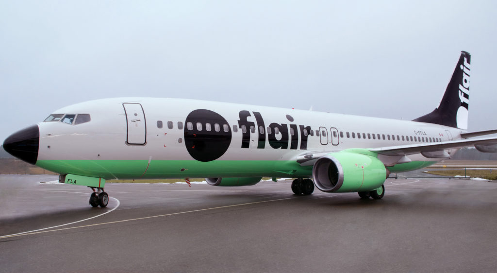
On Feb. 13, Flair Airlines — Canada’s only independently owned ultra-low-cost carrier — announced a major rebranding to reflect the company’s vision for the future.
“For too long Canadians have had virtually no competitive choice between the cozy duopoly of full service airlines,” stated David Tait, Flair’s executive chairman. “But our fares are as much about competing with the great Canadian couch as with the ‘big two’ and the new look we are about to introduce will make us even harder to ignore.”
Flair’s — quite literally — top to bottom redesign includes a new website and URL, a new logo that will define its brand, bold colours that will harness visitors’ attention, new crew uniforms and of course an eye-catching new aircraft livery.
The rebrand will set the course for the airline’s next stages of growth. Since last summer when it announced Edmonton as its new headquarters, Flair has increased its workforce by some 20 per cent to over 300 workers, relocated to four floors of office tower at Edmonton International Airport, introduced new international routes and welcomed the first Boeing 737-800 aircraft into its fleet — four more are due to arrive by the end of 2019.
“The bright modern design is reflective of the positive spirit we want travellers to experience and makes a solid statement that Flair is on a mission to make travel more accessible, more affordable and more desirable while allowing us to add little humour along the way,” said Charles McKee, Flair’s chief commercial officer.
Key highlights of Flair’s rebrand:
- New flight attendant uniforms, with special accents created by up-and-coming Canadian designer CarryCorp (set to be released in April 2019);
- An entirely new aircraft livery, with the first Boeing 737-800 due to enter service in March 2019; and
- Airport signage, in-flight menus, flyflair.com website and more.

Good luck to Flair. For all our sales I hope the company suceeds.
My GAWD…the marketing company that came up with this design should be closed down…that is terrible !!
With all the talented livery design folks out there this is what FLAIR came up with ?????
GRASSHOPPER PIE … UGH !
I had to check the calendar. I didn’t think it was April Fools day.
Bold is not how I would describe this. It looks like they just de-iced. That will look good in July- in Mexico.
Well as long as they spell your name correct- any press is good press, I guess.
Ugly!!!!!!!!!!!!!!!!!!!!Hope the interior doesnt carry this.. wow…UGLY
I COULD GET MY GRAND DAUGHTER IN DAY CARE TO
DO A BETTER JOB. THE PERSON WHO CAME UP WITH THIS DESIGN HAS NO IDEA OF A PRACTICAL PROPER
DESIGN LIVERY. I CAN HARDLY WAIT TO SEE THE NEW
UNIFORMS.
One of the ugliest airline liveries in existence. Shocking that anyone would pay a marketing company to create that look!